John Scalzi posted a link today to a website that offers to design living spaces based on a Star Trek: TNG (and DS9 and Voyager) asthetic. These Trekkish designs seem to be mostly about wall panels and lighting effects, especially in a room called the brig. Umm, we don't have a brig. We seldom have the need to lock up anyone up, even the dog. So why would I hire this guy to design a brig for us?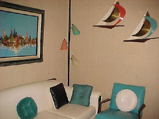
The living areas on the web site are kind of pretty, but not comfortable or livable. Most of the time, it's hard to tell what kind of room you're in, and how you're supposed to function in it if you're not a Borg. I didn't see any place to watch tv from a cushy futuristic chair, with a hi-def tv screen big enough to get a good look at that Class M planet (or Randy Johnson's fastball). I also don't see a living quarters-style bedroom, in which I hope a real person gets a king-size bunk.
The lack on such things on the website (unless I failed to recognize them) may be a tacit acknowledgment that once you leave the kitchen and the brig, you're going to go about the rest of your life in more normal surroundings. All in all, I'd rather live in the Monsanto Plastics Home of the Future in Disneyland, circa 1960 (without the tourists, of course). Not having been there, however, I'm probably overestimating the user-friendliness of that old projection of future living space.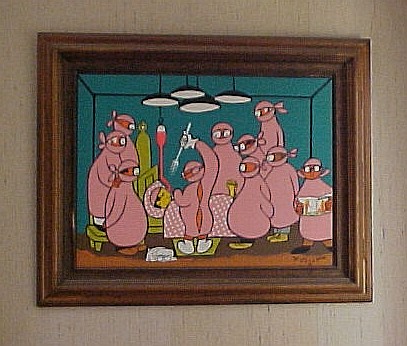 As for Star Trek, I much prefer twenty-third century designs. John was watching Star Trek: TOS Season One yesterday. Now, that's pretty! We like bright colors. They're much more in keeping with the midcentury modern asthetic in our own decor, as shown in these pictures. I wouldn't mind having a dining room someday that looks suspiciously like the NCC 1701 briefing room.
See, during the 1980s and 1990s, and even through today in most homes, only kids have been allowed to have color. Walls were white or beige, furniture was tan or brown or olive or dull blue, and carpets and tile were brown or tan. As John often says, mockingly, "You like earth tones!" 
No, we don't, at least not to the exclusion of everything else. We like red and yellow and bright blue, lime and turquoise, teal and salmon, chartreuse and purple and even orange. We like our colorful, silly painting by bandleader Xavier Cugat. We like housewares from Target, and tv sets in colors reminiscent of early iMacs. When we finally get around to refinancing and fixing up our house for resale, we won't be installing our colorful retro toilets and sinks we bought from a salvage supply, because the house will be sold, and the real estate agents will want everything to be white and beige. But they will be installed in our next house, wherever that may be. Maybe then we'll finally have floors that aren't covered in faded orange or stained tan carpeting. Anybody know where I can get some out-of-production indigo Pergo flooring?
Karen

 You are looking at an archive edition of


1 comment:
Looks like stuff from the 1960's! HA HA HA.
Post a Comment